Home Open
Before I get too soppy, the main reasons for this post were to give you some cheap update ideas for your home, a few tips for simple styling for sale and giving you a sneaky-peak into our lives and home. Enjoy.
Here are some simple tips for refreshing your home before sale:
1. Keep colours neutral.
You may love neon pink or cobalt blue but not everyone will - and not everyone has the imagination to see past it if they don’t like it. You don’t have to avoid colour, just stick to colour in flowers, soft furnishings and artwork.
2. Keep spaces bright.
I do love a good moody Abigail Ahern or Kelly Wearstler room, but I think this belongs in a space that you are going to inhabit for the long term. If you want to maximise the range of interest, keep it light, bright and airy. Lighting at many different levels adds interest - think combinations of candles, table lamps, floor lamps, overheads, wall sconces or whatever you have at your disposal.
3. Fresh flowers and plants (or even good fakes ones) are a must.
They bring colour, style and life (or appearance of life if faux) to your space, not to mention fragrance. Just don’t let the fragrance be too overpowering - air out spaces, keep water fresh and replace flowers if they start to get a bit droopy or pongy.
4. Decluttering is a given really.
Noone want to buy the house of a hoarder, who knows what else you might find after purchase. Pair back your living spaces and tidy display areas. That doesn’t mean depersonalise or make it impossible to live, but presenting the space how people would like to live (i.e. neat, organised, stylish) sells a lifestyle not just a house.
Feel free to disagree as every house has it’s own personality. Below are a few before and after’s of our own house to give you some ideas.
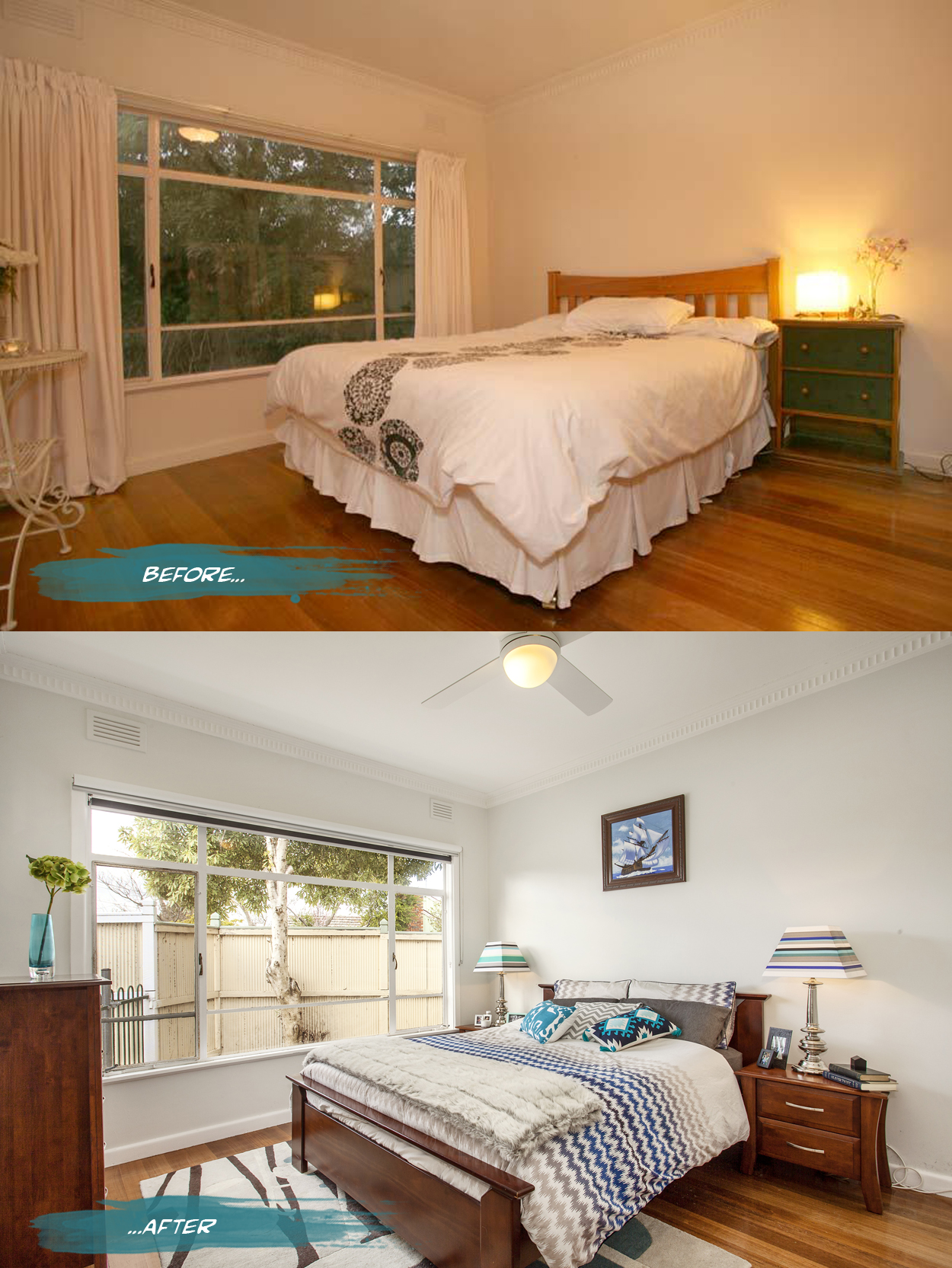
{In the master bedroom, all the curtains were removed from the house to bring more light into the spaces and reduce some of the heaviness of the rooms. Both block out blinds and sunshaders are in the bedrooms while just blockouts are in the living spaces. The walls are a pale grey, Nippon Nighthawk 1, and the ceiling light was replaced by a fan and light for much more comfortable summer sleeps. Adding a rug, cushions and throws for softness as well as customising my lamp shades makes it a bit more personal. Spaces can still have personality while being clutter free - just choose a few key pieces like books and photo frames to make the space feel lived in and not like a showroom}
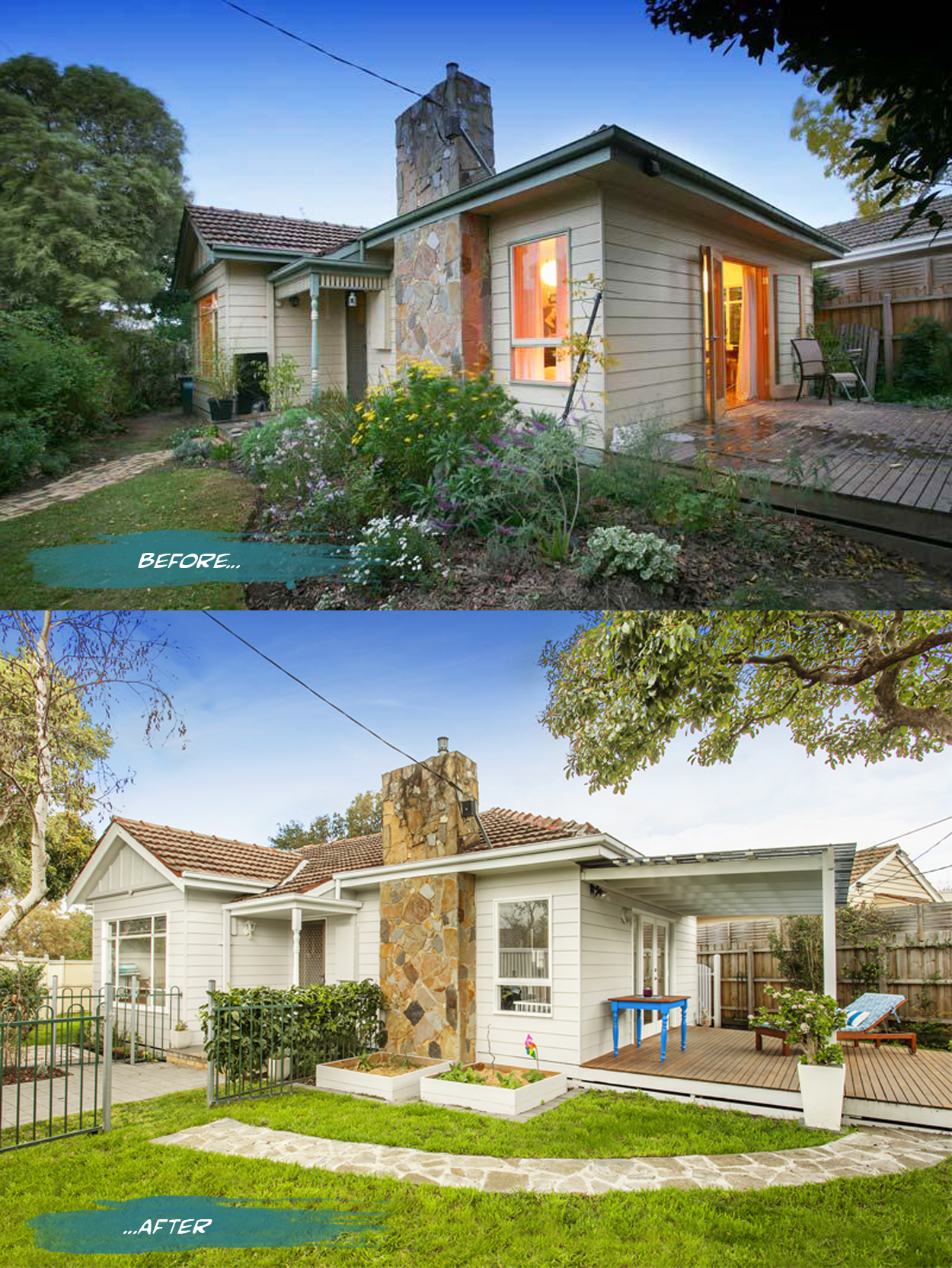
{This is the angle that hooked us on the house 5 years ago (the before shot). The funny thing is that we really liked the charming cottage-style garden when we bought the house, but within a few weeks it was a jungle and way too high-maintenance and impractical for our lives, so it was the first thing to go. We stripped back a lot of the overgrown vegetation to allow for room for the boys to play and let more light into the house. The deck has been covered expertly by builder-super-dad. We repainted the local green trims with Vivid White and the boards with Dulux Dieskau, a subtle grey with a very slight earthy tone to complement the warmth in the existing roof tile. The side gates to the entry pathway were added to keep our guests safe from our loudly welcoming dog, and the path and entry gate were widened and centred to the door. Two veggie patches were added and have provided us with many a tasty meal. The bold Santorini blue table was a road-side pickup find that I rescued, seen before here}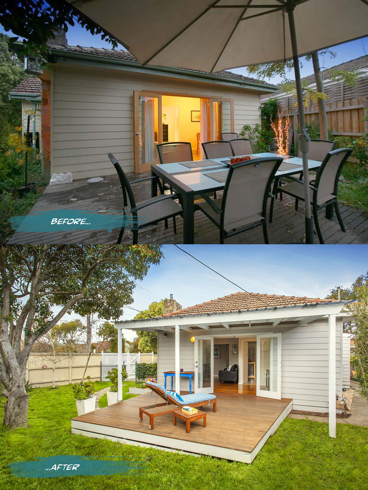
{Adding the patio for a bit of sun-shading and weather protection was the major change. However, just cutting back overhanging branches and crowding vegetation has opened up the yard and allowed the grass to grow - an essential for two little boys! Oiling the deck brings out the rich colour and ties it in to the indoor flooring for continuity, although it does need another coat - if Melbourne will give me a rain free day before auction! The crazy paving path was collected from random flower bed edging around the site and repositioned as a path in the most worn area of the grass. A colourful cover and cushion were added over the budget Ikea lounger, set up as a relaxing spot to read a mag while the boys run riot}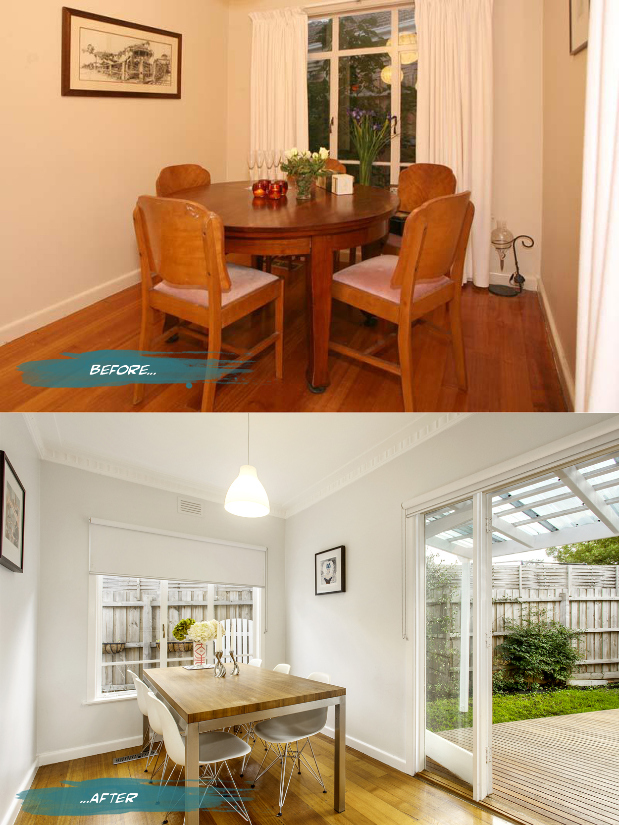
{Again, removing the heavy curtains, painting surfaces in bright, light colours and replacing the pendant with a simple Ikea shade has opened the space up. With the blinds down, fresh flowers and candles lit, we are still able to get a cosy dinner-party atmosphere. The vase has a strip of Anna Spiro wallpaper inserted for a little customisation and colour. The Cobra candle holders are Georg Jensen. Chairs are Eames DSR Eiffel base from Living Edge}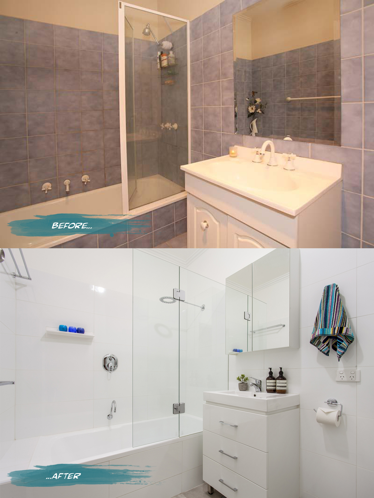
{You may have seen the before and afters of the bathroom previously on the blog here. This was really the only place we spent any money - although we saved by keeping most of the plumbing near or close to its original location. We added a second toilet for maximum value in lieu of a separate shower - we didn’t have room for both. Dealing with toilet-training toddlers all day, I won the vote on that one. In terms of styling, although everyone seems to do it now, adding Aesop products and a Missoni hand towel will up the luxury feel of the space. Before we renovated though, just repainting the walls and ceiling bright white and replacing tap ware made a big difference and helped get us through until we could afford more. If you are going to renovate anything in your house, I believe this is where you will get maximum value-add for your buck}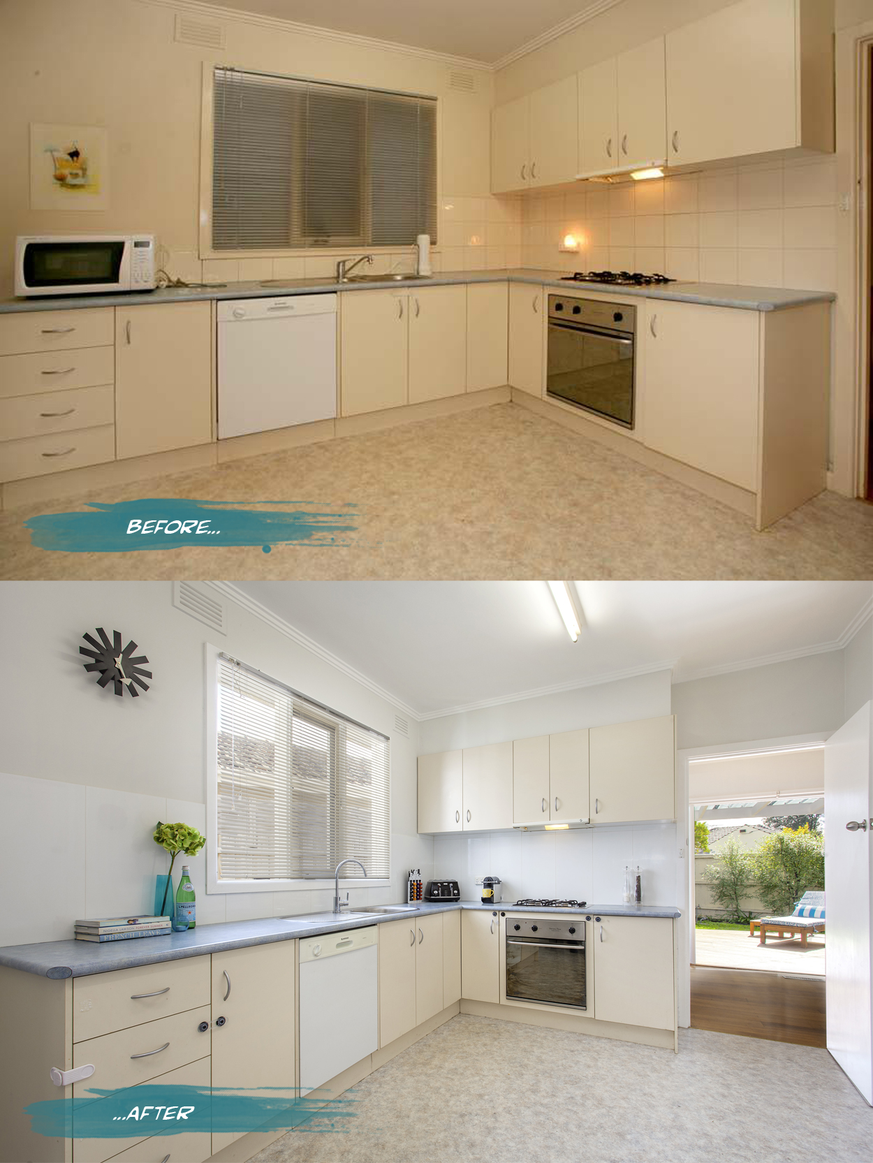
{We only performed basic cosmetic touch ups to the kitchen leaving room for future occupants to open-plan it or renovate. The biggest change in this room was painting over the cream ceiling with ceiling white, updating tapware and replacing the cream tiles with large format white porcelain left over from the bathroom (I accidentally-on-purpose over-estimated the order so that this could get done too). Walls were painted Nippon Nighthawk 1 with Dulux Vivid White on frames, doors and skirting. If we had more time and energy I would have used the gloss white laminate paint that I have in the garage on that cream cabinetry but I’ll leave it as a present for the new owners}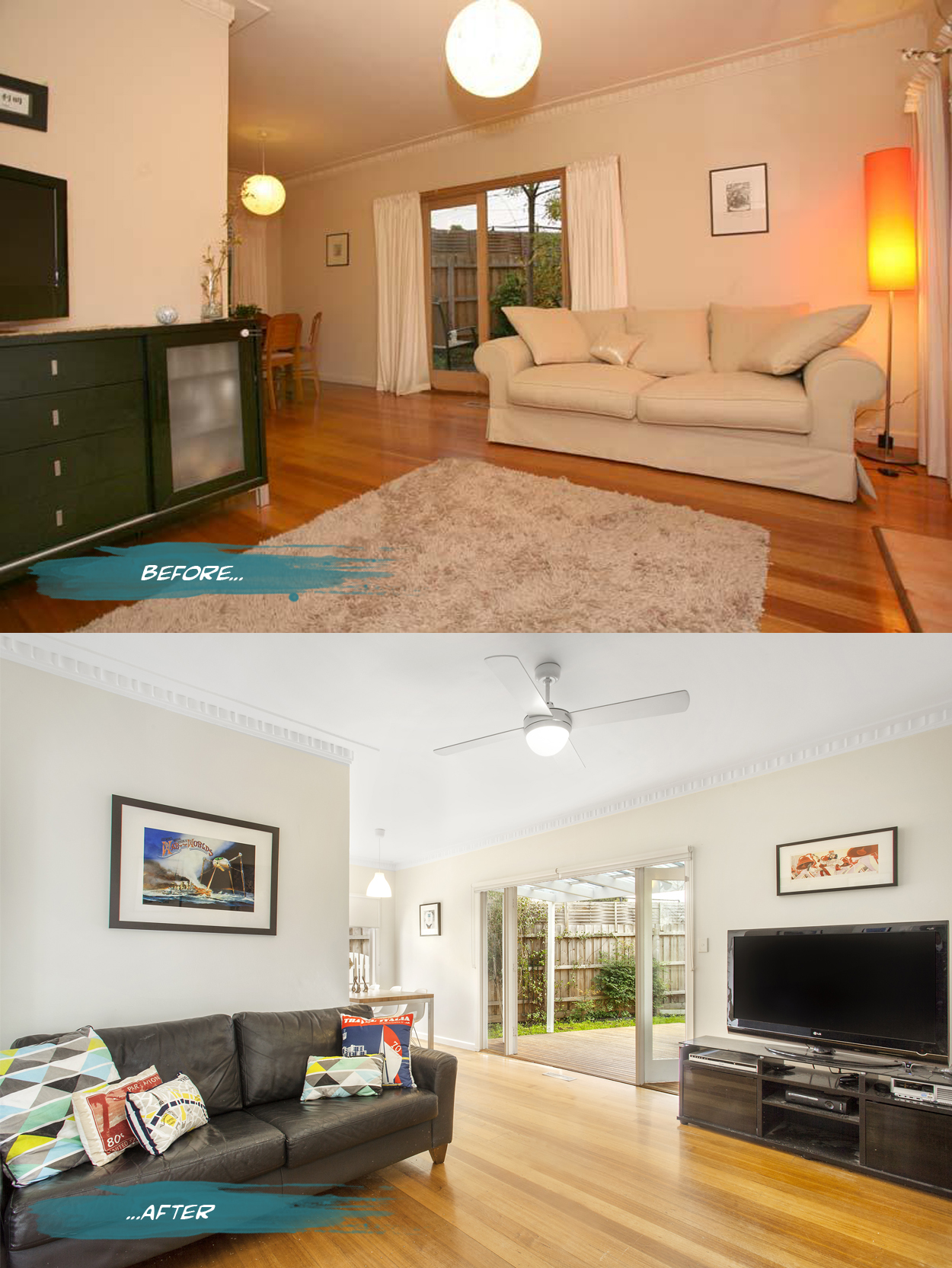
{Walls in our lounge and living spaces were again painted in Nippon Nighthawk 1, with Dulux Vivid White frames, doors and skirting and of course a fresh coat of bright ceiling white. Ceiling fan replaced lounge light for low-energy cooling. Cushions are a mix of Adairs and Freedom, when on sale of course. It is interesting how the same colour paint looks different in every room - remember that when selecting a paint to try it in different lighting and don’t be afraid of it all looking same-same}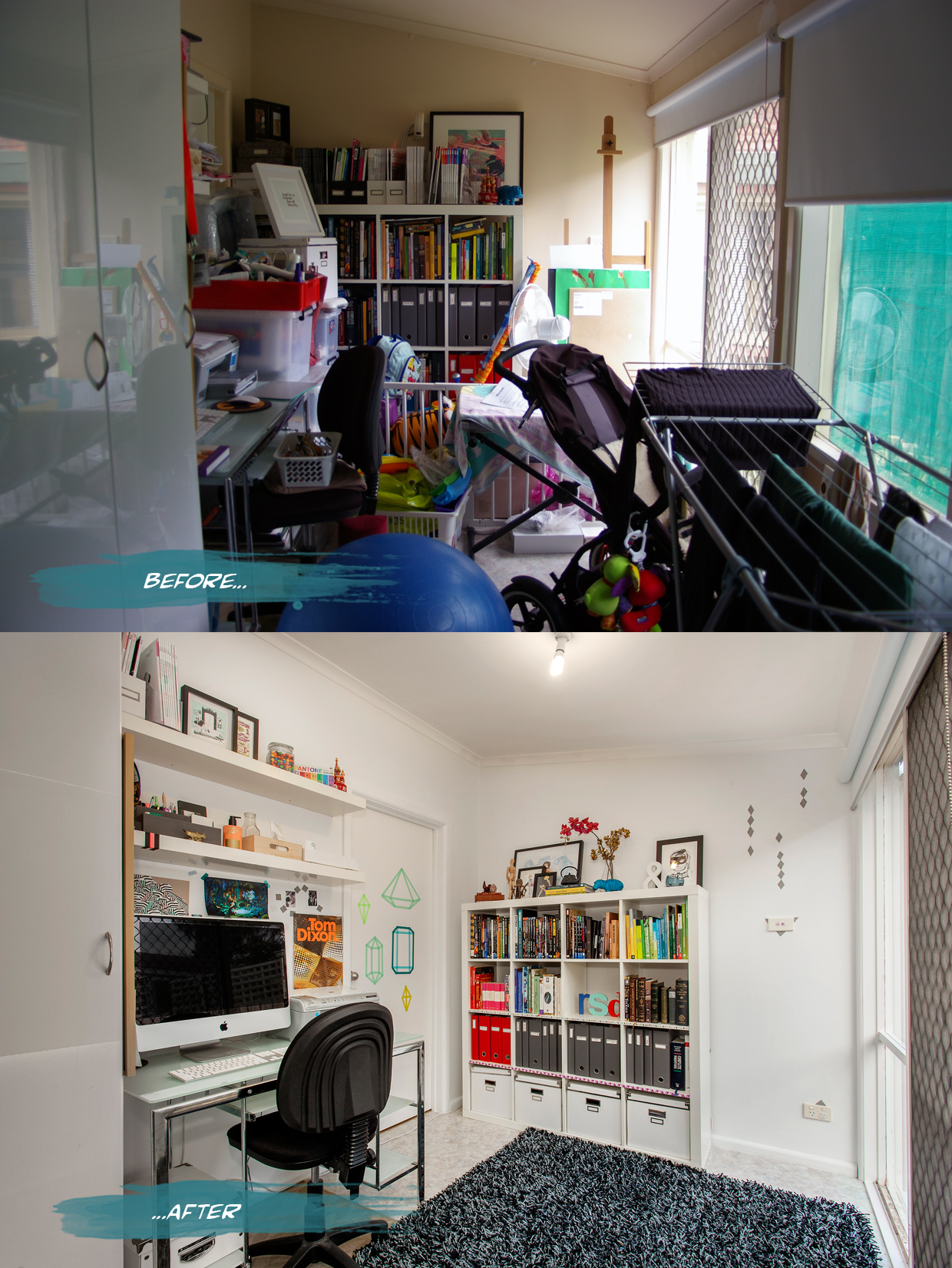
{The office space was previously a dumping ground store-room slash ‘sunroom’ slash laundry that was too hot in summer and too cold in winter. We blocked in some panels of the window wall and painted the whole space white. You can read more about the office clean up here}
Note that all the before shots (except the office) are of the house when we purchased it and include the previous owners furniture. I only comment on what we changed and want everyone to know that you can easily work with what you already own, a little bit of money and a good-sized chunk of effort. Mind you, this was over 4+ years and with two kids popping out in that time, so anything is possible.
You can see more on Realestate.com.au or the Philip Webb site. Last opens for our Blackburn Victoria home are this Thursday 19 Sept and this Saturday 21 Sept before the big Auction - wish me luck!!
Hope you enjoyed this little bit of voyeurism. Maybe see you at the auction!


